
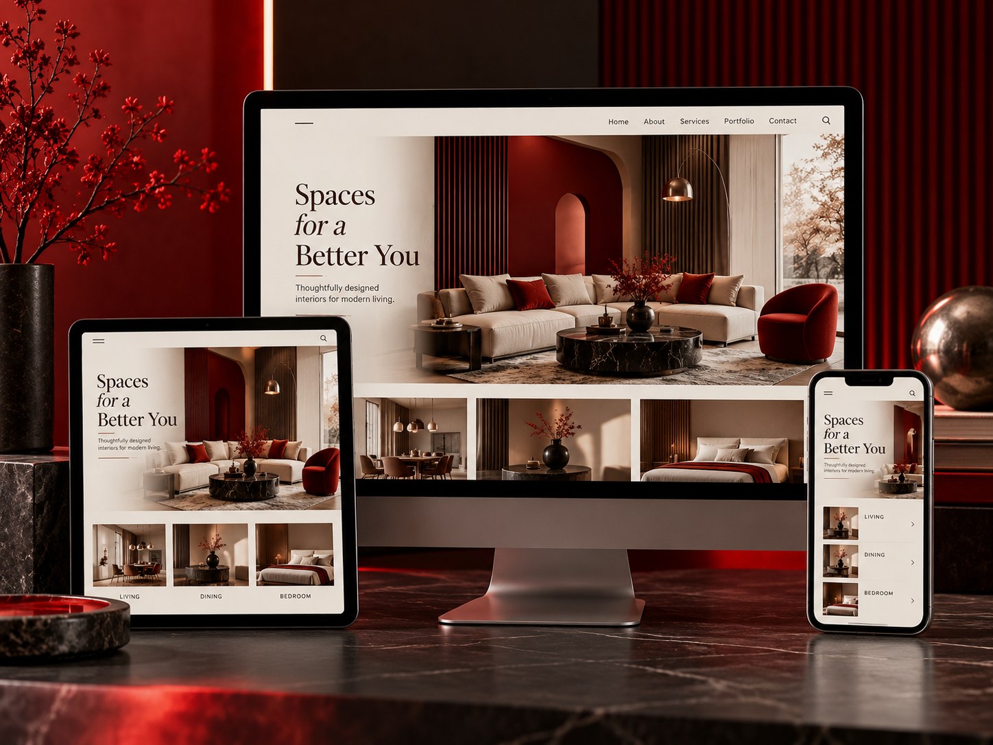
One site that works on every screen.
Layouts that hold up from a small phone to an ultrawide monitor, with images, type and touch targets sized properly at every breakpoint.
Most of your visitors are on a phone, often on a slow connection, often with one thumb. A design that only really works on a designer's laptop is losing the majority of your traffic.
We design mobile-first and test on real devices rather than a browser window dragged narrow.
Tell us about your site
Thanks, .
Your details are captured in this preview. Connect this form to your CRM or email endpoint before launch so requests reach the team.
Mobile-first, tested on real devices
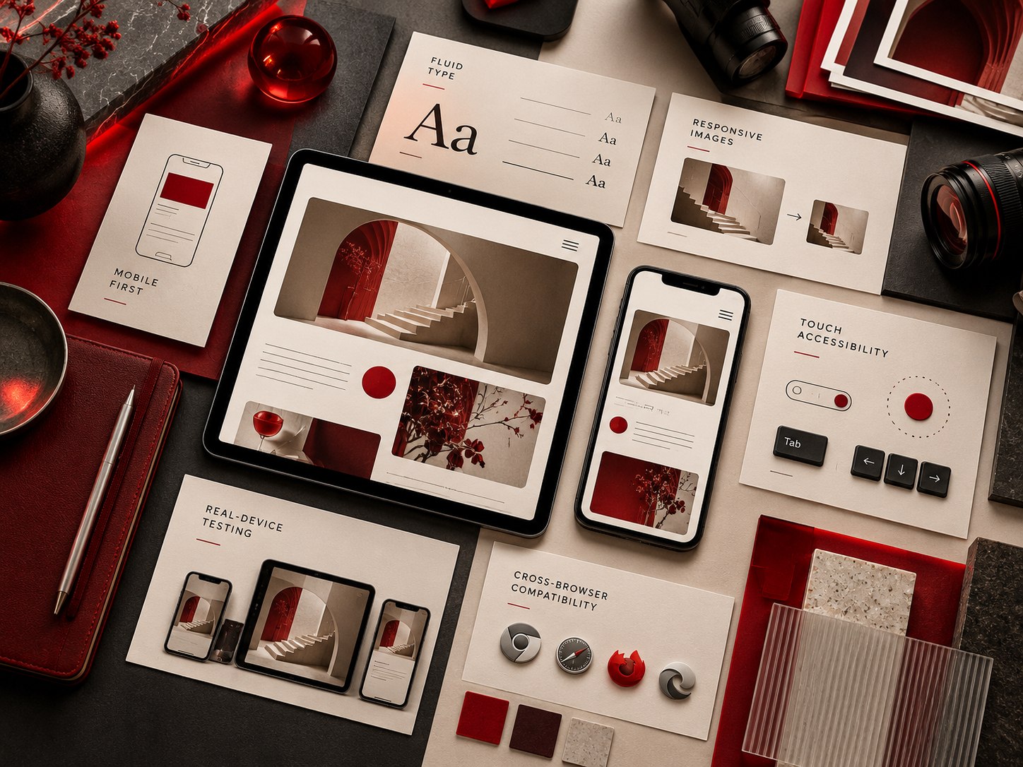
Responsive is not just a layout that reflows. It is type that stays readable without zooming, tap targets big enough for a thumb, images that do not download a desktop-sized file onto a phone, and menus that work without a hover state.
We set a type scale and spacing system that adapts by breakpoint, serve images in modern formats at the right size for each viewport, and make sure every interactive element is reachable by touch and by keyboard.
Then we test on real hardware — older Android phones included, not just the newest iPhone — because that is where layouts actually break.
What’s included
Fixed scope agreed in writing before we start, so you know exactly what is delivered and when. Anything outside it is quoted separately rather than absorbed quietly.
- Mobile-first layout design
- Fluid type and spacing scale
- Responsive image delivery
- Touch and keyboard accessibility
- Real-device testing
- Cross-browser compatibility
Let’s make it work everywhere.
Tell us where things stand today and we’ll reply within one business day with an approach and a realistic estimate.
Why brands keep building with us
Plenty of agencies hand over a website and disappear. We are still here six months later, because the people who designed and built it are the same people who pick up when something needs changing.
Everything happens in-house. Strategy, design, engineering, content and marketing sit in one team of 200+ specialists, so nothing falls through the gap between disciplines.
Over ten years we have launched and grown more than 500 brands across the US, UK, Canada and Germany. You get one point of contact, a staging site you can click through at every milestone, and documentation you own outright.
From scope to stable release
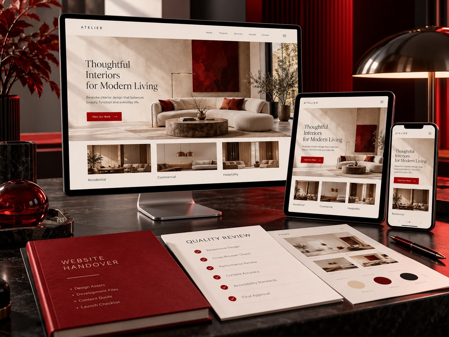
Short sprints, shared boards and a staging site you can click through at every milestone.
Requirements
Features, integrations and success metrics agreed in a written specification.
Prototype
Clickable prototypes validate flows on real devices before development begins.
Develop & test
Sprint-based development with code review, automated checks and QA.
Release & support
Zero-downtime launch, redirects verified, analytics wired and a support plan that fits.
Responsive Web Design questions
Scope, timelines, ownership and what we need from your side.
No. A separate mobile site is a second site to maintain and a second set of URLs for search engines. Responsive design is one site that adapts, which is what Google expects.
Current and older iPhones and Android handsets, iPad, and desktop at common widths, in Chrome, Safari, Firefox and Edge.
Usually. If the markup is reasonably clean we can retrofit a responsive layer; if it is a very old fixed-width build, a rebuild is often cheaper than the workaround.
Yes, positively. Google indexes the mobile version of your site first, so mobile usability and speed directly affect rankings.